Alternatives to Color.review
200 apps like Color.review, closest match first.
Top picks
- R
Randoma11y
LaunchDiscover millions of accessible color combinations with RandomA11y, the real-time color playground.
- A

Accessible Color Generator
LaunchThe Accessible Color Generator is a free contrast tool from LearnUI, a design course site run by Erik Kennedy. Enter a colour you already use, such as a brand colour, and the tool shows the closest variations of it that contrast well agains
Free
- H
Hex Naw
LaunchHex Naw is a color contrast tool for testing a whole color system at once. Instead of comparing colors one pair at a time, you enter up to 12 hex values, and the tool tests them against accessibility and color contrast standards. You add co
- C

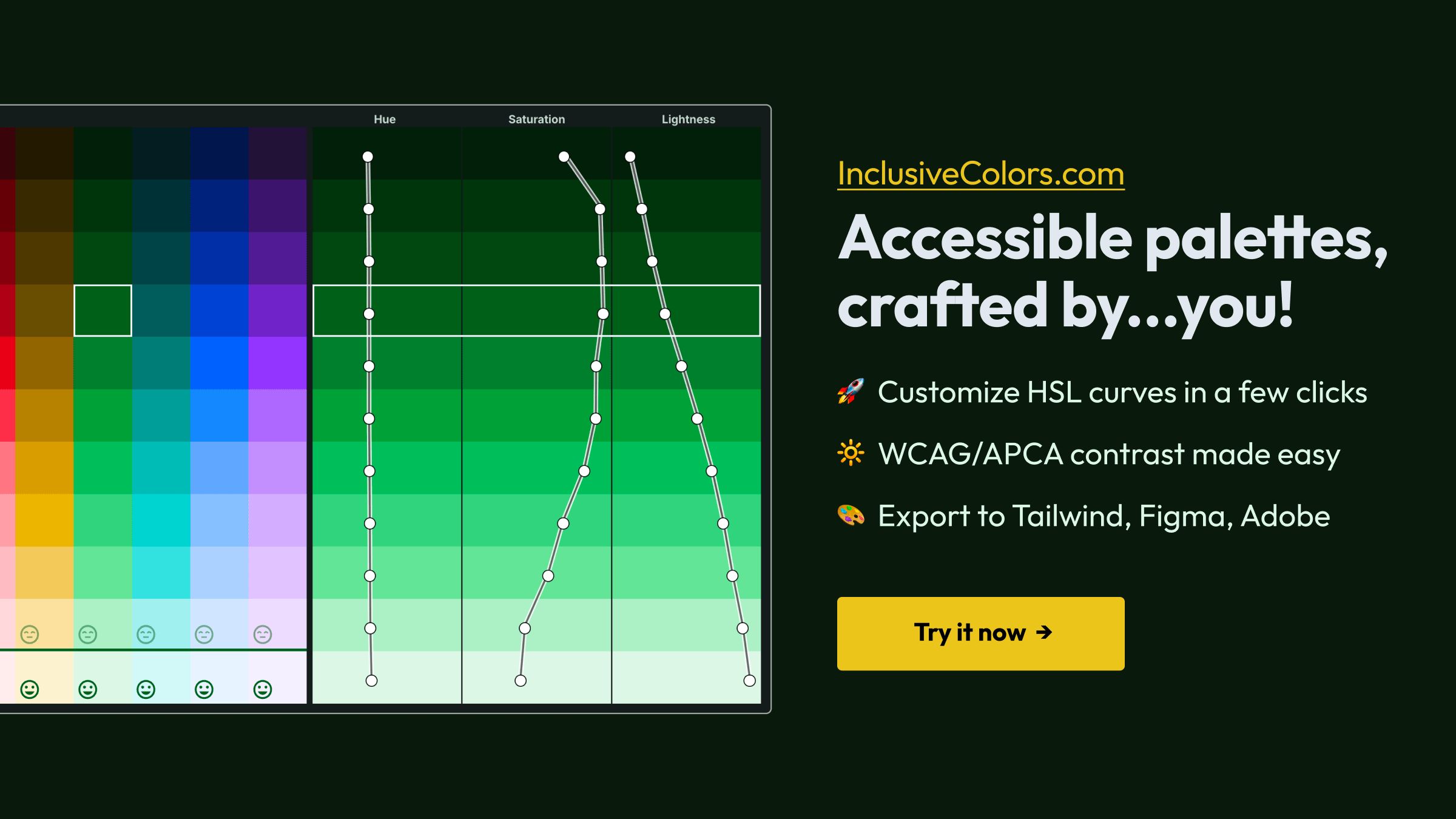
ColorBox
LaunchColorBox is a web app for generating color palettes and color systems. You set the number of steps in a scale, then shape the hue, saturation and brightness of the palette with curves, such as an ease-out curve for hue and an ease-in curve
- S
Skill.color-expert
LaunchAgent skill for color science expertise. Many references covering color spaces, accessibility (APCA, WCAG), palette generation, pigment mixing, and historical color theory. Works with Claude Code, Codex, Cursor, Copilot & others.
FreeOpen source
- C

critique-color
GetA skill for auditing the colour of one rendered screen. It measures text contrast against WCAG AA, which is 4.5:1 for body text and 3:1 for large text, and checks that buttons, inputs and focus rings reach 3:1 against the surfaces next to t
Free
More like Color.review











BrivTools Color Contrast Checker
A free tool to calculate color contrast ratios and ensure WCAG 2.1 compliance

Accessible Brand Colors
This tool shows you how ADA compliant your colors are in relation to each other







About Color.review

Color.review
A modern tool for exploring and finding accessible colors
Color.review is a free web tool for checking whether text and background colors are readable. You enter a foreground and a background color in hex, RGB, HSL or CMYK, and the page shows the contrast ratio, with results for text and headlines against the WCAG thresholds of 3, 4.5 and 7. A Flip control swaps the two colors, and each result has its own shareable check link. The site explains why contrast matters: people perceive colors differently, blue text on white reads far more easily than yellow, and the page cites an estimated 217 million people living with a visual impairment. Beneath the tool is a short guide to color and accessibility that explains how WCAG works. The site uses WCAG for its checks and describes itself as a modern way to find accessible colors.
- Category
- Developer Tools
- Website
- color.review